Box plot and time line chart
Box plot is a graphical statistical tool that shows the distribution of a set of data, providing a simple and effective method to summarize data and identify variation, localization and abnormality (if applicable ) to them. The box plot was created by John Wilder Tukey, an American statistician recognized for his studies in computer science and statistics.
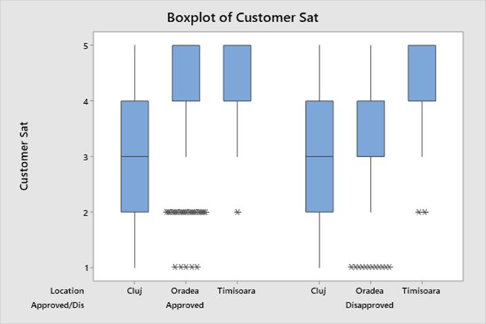
Box plots are very useful for comparing multiple sets of data; by placing several box plots next to each other, it is easy to visualize the similarities and differences between the distributions and locatization of the data sets.
The box plot contains the following elements:
- the median (Q2) is the "middle value" of the data set
- quartile 1 (Q1) is the median value of the first half of the data
- the 3rd quartile (Q3) is the median value of the second half of the data
- "whiskers" minimum and maximum - are the smallest value and the largest value in the data set that is not considered an abnormal value, an outlier
- outliers - those data that are significantly lower or higher than the rest of the data, being further than 1.5 times the interquartile range, which is the difference between Q1 and Q3
The box plot is an essential tool in statistical analysis, its use contributes to a better understanding and interpretation of data, facilitating data-based decision-making to improve processes.
Time line chart or chronological graph is a visual tool to represent events or data on a temporal axis, to track changes over a period of time. It provides visual clarity, helps to identify trends, facilitating the comparison of values and events over time.
The main elements of a timing chart are:
- time representation is on the horizontal axis which must be scaled uniformly and can be divided into time units such as days, hours, months, minutes depending on the required level of detail
- the vertical axis represents types of data, values or measurements that describe the observed event
- the data points are placed on the graph at the intersection of the moment of time on the horizontal axis and the respective value on the vertical axis
- the line connects the data points to show the evolution and trend over time
Thus, the time diagram is easy to create and understand, offering a clear visual representation of the analyzed data to make decisions and actions at the right time.