Box Plot Chart
A Box Plot is a type of graph used to show quantitative data patterns. It provides information regarding the central tendency and the shape of the studied distribution.
The elements of the Box Plot diagram are:
Vmin - The minimum value named and is the smallest value observed in the string of values, excluding outliers;
Q1 - The lower quartile delimits the lowest 25% of the observed values;
Med - The median delimits 50% of the values (it is exactly halfway between the minimum and maximum value);
Q3 - The upper quartile delimits the highest 25% of the observed values;
Vmax - The maximum value is the highest observed value, excluding outliers;
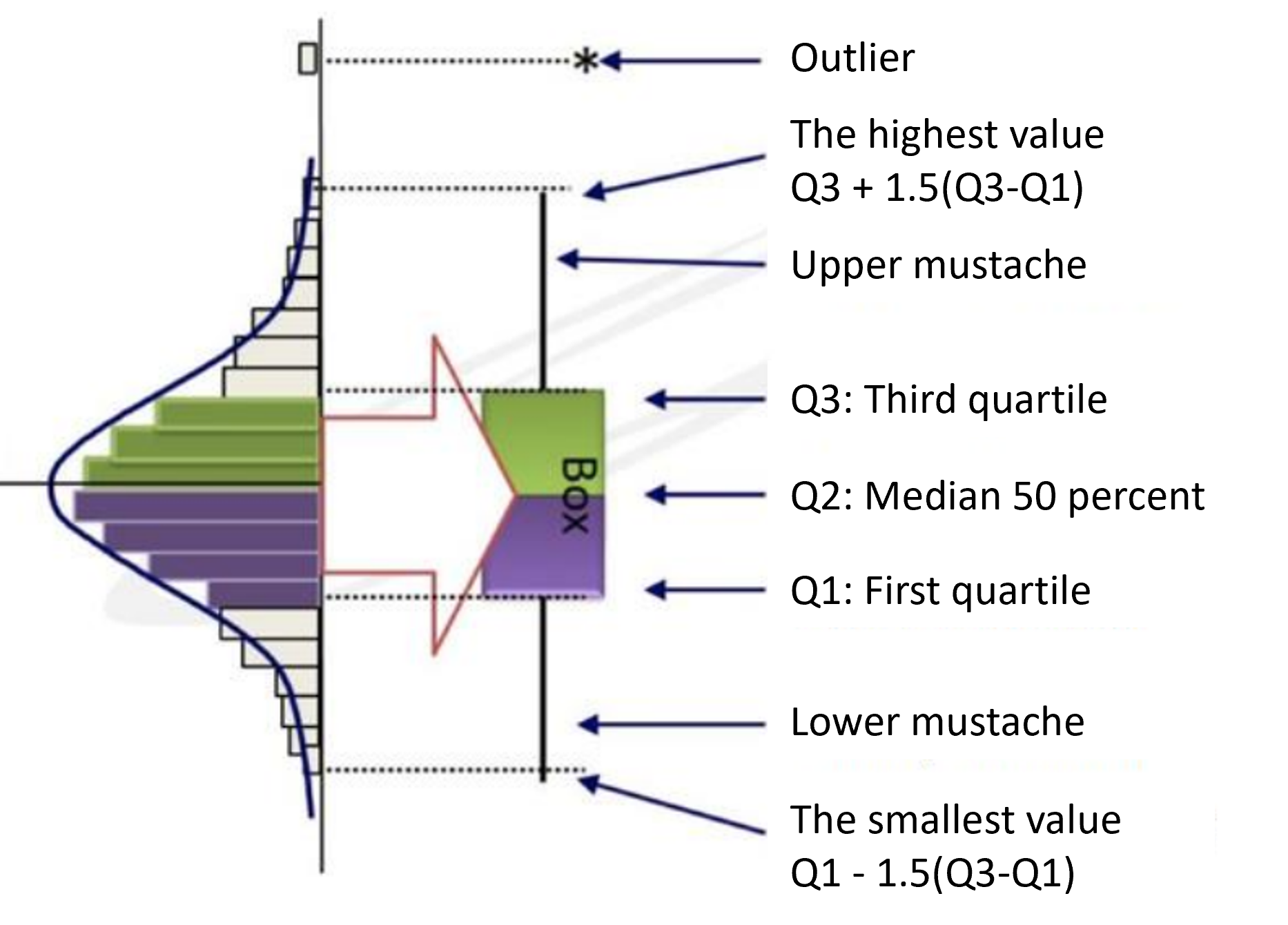
IQR - Interquartile range - is the range between Q3 and Q1. The IQR interval is represented graphically by a rectangle ("box").
Outliers are considered values greater than Q3+1.5 x IQR or values less than Q1-1.5 x IQR.
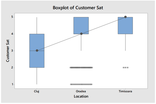
Box Plot is a quick graphical way to examine one or more sets of data. It is also very useful in detecting outliers and discovering errors.
Box Plots have a number of advantages over other graphical methods. They take up less space and are therefore particularly useful for comparing distributions across multiple groups or data sets (see the accompanying graph as an example).
Box Plots were introduced relatively recently (1969) by John Tukey and have since been widely used in medical research, economics and industry (especially manufacturing) and statistical software graphics programs have been developed for their construction. One of the software is MINITAB, also used for other statistical analysis.